Sunday, 19 June 2011
Artist Statement Maybe
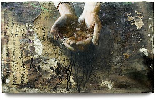
The fragility of one's self is influenced from the contamination of media, negative thoughts, hurtful words, being let down and basically brokenness. Most people will admit to being and feeling fragile at some point in their lives. This mixed media artwork reveals that a story could be told by all human beings; whether told in broken bones or forever untold but always evident in actions and emotions. Being fragile is a great insurcurity, the feeling is usually hidden and stored away behind a smile. Undeniably fragility is challanging many, many people today.
Artist - Rosalie Gascoigne
Rosalie Gascoigne is an Artist who I think has influenced some of my own work. I like the roughness and the edge to her artworks. I like how she uses boards like I have and used text and has created a desired weathered look like I always tried to achieve.


Bascially her use of materials is what has influenced me the most. She has the ability to use simple materials and has given them character and edge to create what she wants in her artworks.
My favourite artwork would be White City by Gascoigne.

As I reflect both my artwork and Gascoigne's I can see a few similarities. The way she has used text, the colour red, light and dark shades of white, a weathered look and the way the boards all fit together.
In my artwork I used text which was the words fragile in the tape (the colour red) and also the screen prints I made of a diary entry and the word fragile. I used dark and light shades of white on my boards because of the way I used either gesso or white paint had an effect. And the length of time in how long I heated the boards for. This affected the colours end result. Either it was a very creamy colour or had mixed with slight black and became grey. Also the way the boards fit together in White City I had to cut some the boards to make them fit into the frame.
Wednesday, 15 June 2011


Light and wrapped guitars

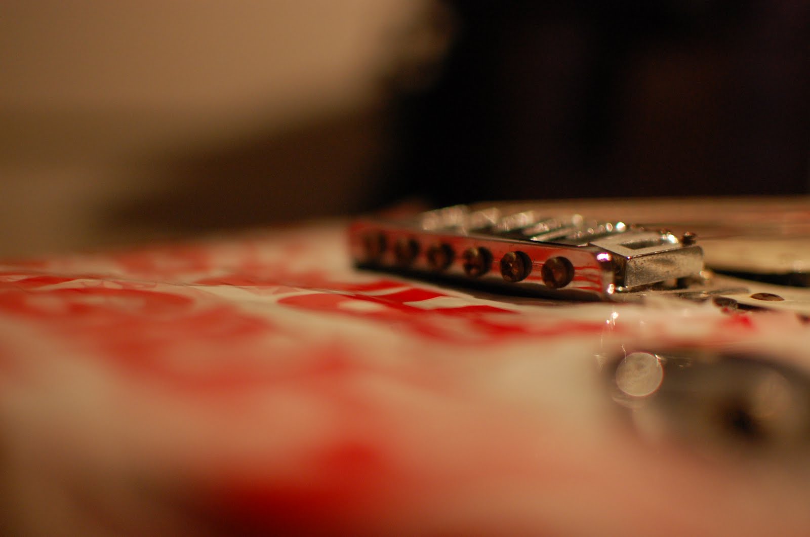
I took this photo in my room when I had first fragile wrapped this guitar. I had to get the lighting right so the camera would want to focus properly. Once I had taken this photo I liked the depth of field and how the strings are the main focal point.
Monday, 13 June 2011
Final Photos I chose

I chose this photo because I liked the way the subject is exactly centered. I like the contrast of the subject's skin to the background and the way she is presenting herself in the image. The way in which she is clasping onto the balled up bubble wrap could display how when you are fragile you try to hold on to things that you need most. Such as a need for something to distract you from pain and brokenness.


I chose this photo because of the depth of field with the glass. I like that it is the main focal point and not the human. Generally we associate the broken glass image with the label fragile used on packages and boxes. This is why I used the glass and made it the main focus of one the photos. It is a recognizable image and it can be seen that a glass is fragile just like a human - easily breakable. I also like the composition of this image. It is off center slightly and her whole torso to top of the head fits in the image.

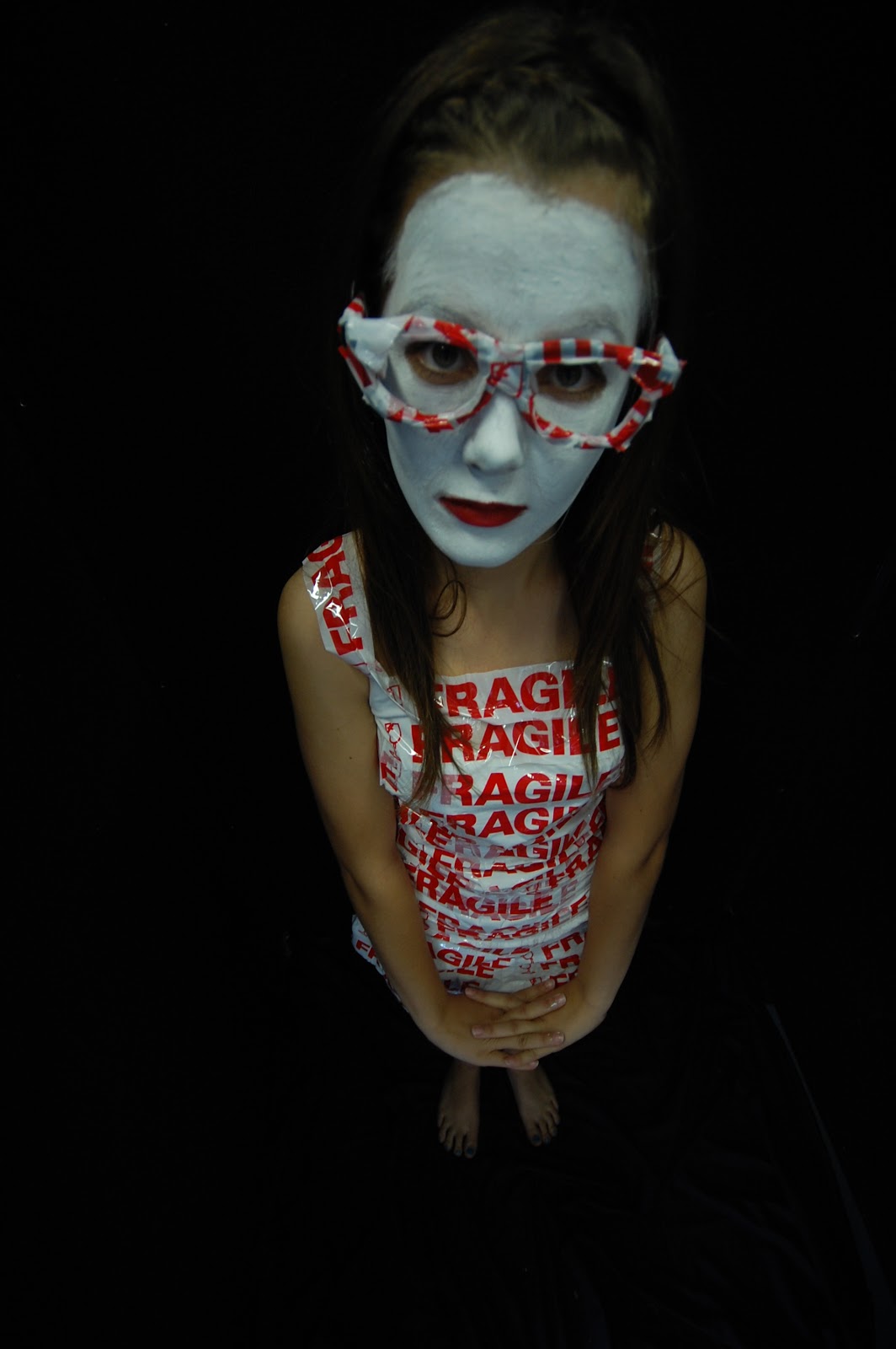
I think this photo is very strong and that's why I choose it. Not strong in the message perhaps but the way it is presented. I like how the subject is centered and the contrast between her skin and the black background. It is a high angle shot and I was standing on a chair when taking this image. I like how it shows that she is 'small.' Feeling small takes a very big part in a human feeling like they are worthless and let down. I like how the fragile tape is across her mouth as if she is letting everybody know how she feels inside.
All Photos taken with wide angle lens and Nikon
Narrowing down the final photos


Dark guitar

I took this photo when I was just testing the camera in my room after I had wrapped the guitar. The dirty look of the strings and the darkness and yellowness of this photo is what I like most. I admit it's not a very well developed photo due to the bad lighting. But I like the rustiness of it and armature-ness of the photo.

Sunday, 12 June 2011

Some example of the photos I took


Subscribe to:
Posts (Atom)